If you are thinking about having a new logo design, congratulations! This means you are either starting a new business, or looking into rebranding one you have already launched. If you’re excited but still don’t know where to start…you’re not alone.
When it comes to brand identity, you want to make the best impression, and might have a million creative ideas on what to do, but perhaps don’t know how exactly to execute those amazing ideas. No worries, I’m here to help.
So, let’s dive right in!
A Crash Course in Branding Identity
Things such as your logo, taglines, slogans, color pallets, and even font choices are all part of what make up your brand identity, but that’s not the only thing.
What do I mean by that?
Brand identity is more than what your brand just LOOKS like.
If you work with a good brand identity specialist, they should help you with realizing that everything is intentional, to make sure you are engaging with the right target audience and conveying your company’s message.
Steps Before creating a New Logo Design
Let’s go over the best things you should do before creating your logo (whether you are doing it yourself or hiring someone to help you).
Before you start on the design of your brand, it’s imperative to complete a design brief to really dig deep into your mission statement and discover what you and your company stand for. Really dedicate your time into giving some profound answers so that everything you believe in can come across in your upcoming marketing.
I highly recommend your logo be designed as a vector image so that you can scale it and have no issues on pixelation. (The program I personally use is adobe illustrator.) Multiple different file types will be needed once you have approved your final design. PNG, JPEG, PDF, EPS, and AI are my go-to file types.
Lastly, before creating your logo, do your research on your designer. The last thing you want is an unoriginal logo that you can’t trademark or copyright if your logo was not an original creation.
The five Things Your Logo Design Needs
- Timeless
- Relevant
- Memorable
- Versatile
- Simple
Here is a deeper dive on that:
1. Your Logo Should be Timeless
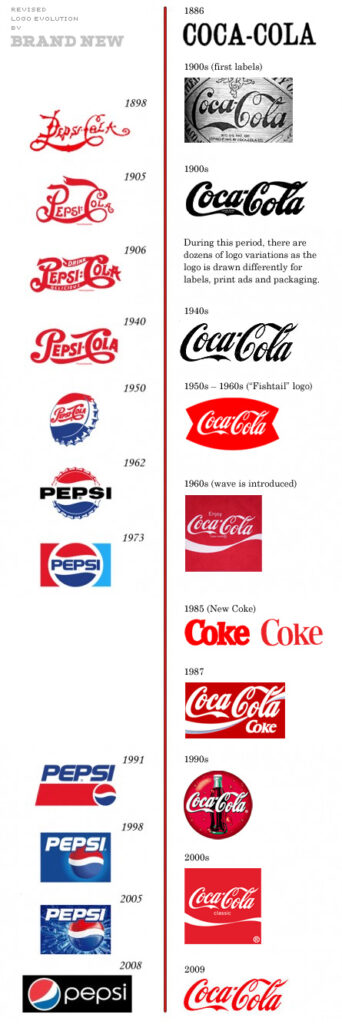
What do I mean by that? When I think of timeless, I can’t help but think of the Pepsi vs. Coca Cola logo. Take a look at the picture below and see which logo aged well, and still was able to use elements of their original design. A logo should be classic, and stand the test of time. Let’s stay away from trendy things that won’t be in style a few years from now.

2. Your Logo Should be Relevant
Have you ever seen a logo that has absolutely NADA to do with the company they are advertising for? Unless you are Starbucks, please stay away from this trend. Your logo needs to clearly communicate your brand’s identity.
Pro Tip: You can still set yourself apart without being too generic by being creative, and still use a symbol to represent your brand accurately. Try to focus on your values to elicit an emotional response that is inline with your branding and what you want to communicate.
3. Your Logo Should be Memorable
Standing the test of time is hard to do. Heck, I’ve had multiple business ideas and branding changes until I finally settled on what was memorable enough for me.
Here is an example of a logo I created that was for my dentist at the time.

We zoned in on the common fear that many people have going to the dentist. This inspired her to make her office as spa-like as possible. Gentle lighting, calming music, and soothing massage chairs at a dental office was what set her apart! This logo is memorable, because although it does not have an obvious “tooth” in there, you are both curious and intrigued, yet understand her branding.
4. Your Logo Design Should be Versatile
A lot of times, logos look amazing on a shirt, but then can’t be sized down to a letterhead. Conversely, they might look great on a pen, but won’t work on a billboard. Your new logo needs to be versatile and scalable. Have your graphic designer to mock-ups to see your logo on things like a pen, an envelope, the front door of a business (dream BIG), tablet screens, and so on.
I would recommend you request two different versions of your logo: vertical or horizontal (some logos work both way, but some are only meant to be one or the other), and an icon. That way, you can use which one is needed at the right time.
Here is an example of a logo in three different versions:
This one is vertical:

Here is the horizontal version:

Here is the icon solo:

5. Your Logo Should Be Simple
Lastly, and most importantly, a logo should be simple. This ties into it being timeless and memorable. I know, I know, no one uses a fax machine anymore–but your logo should still work in black and white. Make sure your logo is still legible, regardless of color. It is recommended to stick to 2-3 colors for your final logo, but that is not a hard rule, and when it comes to art, you or your graphic designer will have a subjective view on how many colors are “too much.”
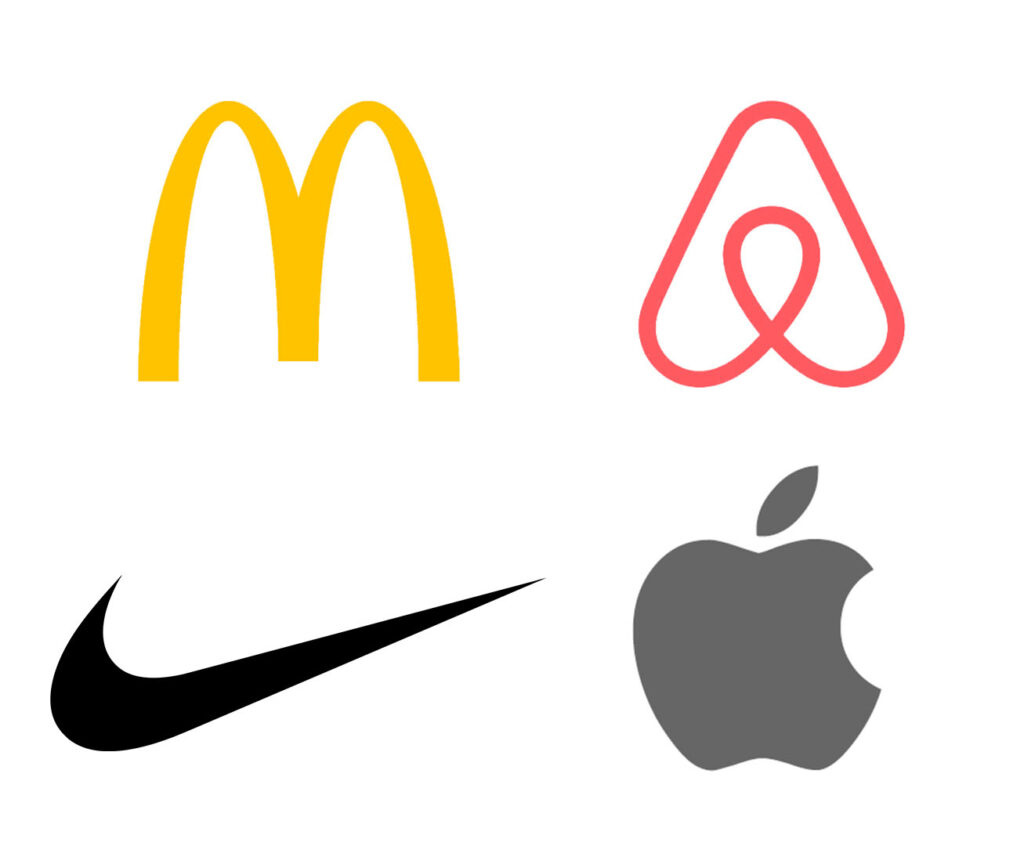
When you think of logos, think of the simplicity in the “swoosh” of the Nike brand, the uncomplicated apple logo, or the iconic golden arches of McDonalds. The straightforward red circles from Target’s logo also comes to mind when thinking of brands that “K.I.S.S.” (Keep it simple, stupid.) Even Airbnb’s logo is extremely easy to remember.

Per entrepreneur.com, they say this about Airbnb’s new logo:
The symbol itself is a combination of four simple symbols: a head to represent people, a location icon to represent place, a heart for love and then an A for Airbnb. A video (embedded below) explains the geometry of Airbnb’s logo.
In conclusion
To recap, make sure you start off with taking a deep dive into your mission, values, and beliefs before embarking on a new logo design. Establish a strong foundation in your branding by starting with a logo that is timeless, simple, relevant, and memorable! I highly recommend designing something from scratch to truly customize your own company. If your budget allows, hire a freelance graphic designer or branding specialist to assist you with this vital piece of your branding.
Until the next one, remember to innovate, elevate, and resonate!
Connect With Me

